110. Bayesian Estimation of Nonlinear Unemployment Dynamics#
GPU
This lecture was built using a machine with access to a GPU — although it will also run without one.
Google Colab has a free tier with GPUs that you can access as follows:
Click on the “play” icon top right
Select Colab
Set the runtime environment to include a GPU
In addition to what’s in Anaconda, this lecture needs the following libraries.
We first install numpyro and jax:
!pip install numpyro jax
We also install pandas_datareader, which we use to download data from FRED:
!pip install pandas_datareader
110.1. Overview#
This lecture is a sequel to A Linear Model of Unemployment.
There we fit linear models to the US unemployment rate and ran into a tension.
At a monthly frequency the series looks almost like a random walk — yet a random walk wanders off, while unemployment stays in a band.
The linear model can square these only on a knife-edge, with \(\phi\) a hair below one and the same gentle reversion at all times.
Here we resolve the tension with a nonlinear model: one that drifts like a random walk in normal times, but whose restoring force strengthens far from the normal level, so the series is kept from ever wandering away.
The model is a one-dimensional stochastic difference equation, so it is simple enough to understand completely while still being rich enough to be interesting.
The model is a one-dimensional stochastic difference equation, so it is simple enough to understand completely while still being rich enough to be interesting.
We study its dynamics, estimate it from US data, and then ask the honest question: does the nonlinearity actually earn its keep?
For estimation we again use the No-U-Turn sampler (NUTS) in NumPyro; see Non-Conjugate Priors for a brief account of how it works.
Our plan is:
write down the model and understand its restoring force,
study its dynamics — stability, mean reversion, and the stationary distribution,
estimate it from US unemployment data and see what the data can and cannot tell us,
compare it head-to-head with the linear model.
Let’s start with some imports.
import numpy as np
import matplotlib.pyplot as plt
import datetime as dt
from pandas_datareader import data as web

import jax.numpy as jnp
from jax import random
import numpyro
import numpyro.distributions as dist
from numpyro.infer import MCMC, NUTS
110.2. The model#
Let \(u_t\) denote the unemployment rate at time \(t\), measured in percentage points (so \(u_t = 5.0\) means \(5\%\)).
We model it as a nonlinear first-order stochastic difference equation,
with \(\beta < 0\) and \(\lambda > 0\).
The model has four parameters:
symbol |
name |
role |
|---|---|---|
\(\bar u\) |
natural rate |
the level toward which \(u_t\) is pulled |
\(\beta\) |
reversion strength |
the size of the pull (negative) |
\(\lambda\) |
nonlinearity scale |
how sharply the pull responds to the gap |
\(\sigma\) |
shock volatility |
standard deviation of the monthly/annual shocks |
The term that does the work is the restoring force \(\beta \tanh(\lambda (u_t - \bar u))\).
Write \(g = u_t - \bar u\) for the gap between unemployment and the natural rate.
When \(u_t\) is above \(\bar u\) the gap is positive, \(\tanh(\lambda g) > 0\), and since \(\beta < 0\) the force is negative — it pushes unemployment back down.
When \(u_t\) is below \(\bar u\) the force is positive and pushes it back up.
So the force always points back toward \(\bar u\).
The function \(\tanh\) is what makes the pull nonlinear, and we will see that it has a very convenient property: it saturates.
110.3. Dynamics#
We now study how the model behaves, setting the shocks aside for a moment.
Our roadmap is: first the deterministic skeleton and its 45-degree diagram, then the separate roles of \(\beta\) and \(\lambda\), and finally the stationary distribution that emerges once the shocks are switched back on.
110.3.1. The deterministic skeleton#
Setting \(\varepsilon_{t+1}\) to its mean of zero turns (110.1) into the deterministic map \(u_{t+1} = g(u_t)\), where
The function below evaluates this map.
def g(u, ubar, β, λ):
    "The deterministic skeleton of the unemployment model."
    return u + β * np.tanh(λ * (u - ubar))
A 45-degree diagram plots \(g\) against the line \(u_{t+1} = u_t\).
Fixed points sit where the two cross, and we can read off stability from the slope of \(g\) there.
The next cell draws the diagram for illustrative parameters and adds cobweb paths from two starting points.
ubar, β, λ = 5.0, -0.5, 1.0
grid = np.linspace(0, 12, 400)

fig, ax = plt.subplots()
ax.plot(grid, g(grid, ubar, β, λ), lw=2, label='$g(u)$')
ax.plot(grid, grid, 'k--', lw=1, label='45 degrees')
ax.axvline(ubar, color='C2', ls=':', lw=1, label='$\\bar u$')

def cobweb(u0, n=30):
    xs, ys, u = [], [], u0
    for _ in range(n):
        xs += [u, u]
        ys += [u, g(u, ubar, β, λ)]
        u = g(u, ubar, β, λ)
    return xs, ys

for u0, c in [(9.0, 'C1'), (1.5, 'C3')]:
    xs, ys = cobweb(u0)
    ax.plot(xs, ys, c, lw=1, alpha=0.8)

ax.set_xlabel('$u_t$')
ax.set_ylabel('$u_{t+1}$')
ax.legend()
plt.show()
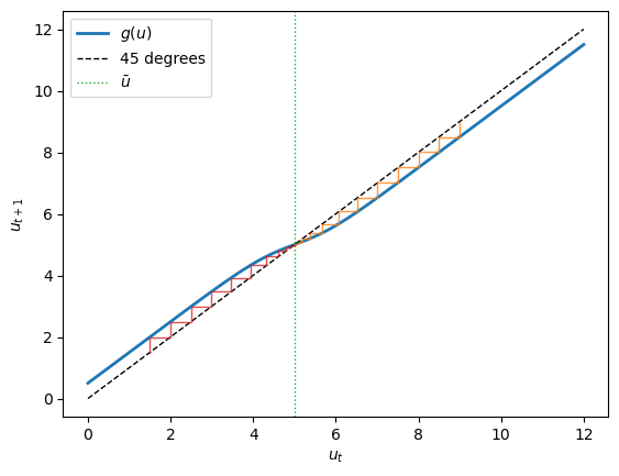
The map crosses the 45-degree line exactly once, at \(\bar u\), so \(\bar u\) is the unique rest point.
Two things make it a stable one.
Near \(\bar u\) the curve is flatter than the 45-degree line, so the cobweb staircases inward.
Far from \(\bar u\) the curve runs parallel to the 45-degree line but shifted: the saturated force is a constant \(\pm|\beta|\), a steady pull back toward equilibrium no matter how large the gap.
This bounded, always-inward pull is what keeps the model globally stable.
We can confirm the local picture analytically.
Differentiating \(g\),
Near \(\bar u\) the gap therefore evolves approximately as \(g_{t+1} \approx (1 + \beta\lambda)\, g_t\) — a linear AR(1) with persistence \(1 + \beta\lambda\).
So small deviations decay geometrically, and they decay faster the larger is \(|\beta\lambda|\).
110.3.2. The separate roles of \(\beta\) and \(\lambda\)#
The local approximation reveals something important: near \(\bar u\) only the product \(\beta\lambda\) appears.
To see what each parameter does on its own we have to look at the whole restoring force, \(m(g) = \beta\tanh(\lambda g)\).
There are two independent things to control, and \(\beta\) and \(\lambda\) control one each.
gaps = np.linspace(-6, 6, 400)
fig, (axL, axR) = plt.subplots(1, 2, figsize=(11, 4.2), sharey=True)

for b in (-0.2, -0.4, -0.6):
    axL.plot(gaps, b * np.tanh(1.0 * gaps), lw=2, label=f'$\\beta={b}$')
axL.set_title('vary $\\beta$ (fixed $\\lambda=1$)')
axL.set_xlabel('gap $g = u_t - \\bar u$')
axL.set_ylabel('mean of $\\Delta u$')
axL.axhline(0, color='k', lw=.5)
axL.axvline(0, color='k', lw=.5)
axL.legend()

for lm in (0.3, 0.7, 1.5):
    axR.plot(gaps, -0.4 * np.tanh(lm * gaps), lw=2, label=f'$\\lambda={lm}$')
axR.set_title('vary $\\lambda$ (fixed $\\beta=-0.4$)')
axR.set_xlabel('gap $g = u_t - \\bar u$')
axR.axhline(0, color='k', lw=.5)
axR.axvline(0, color='k', lw=.5)
axR.legend()
plt.show()
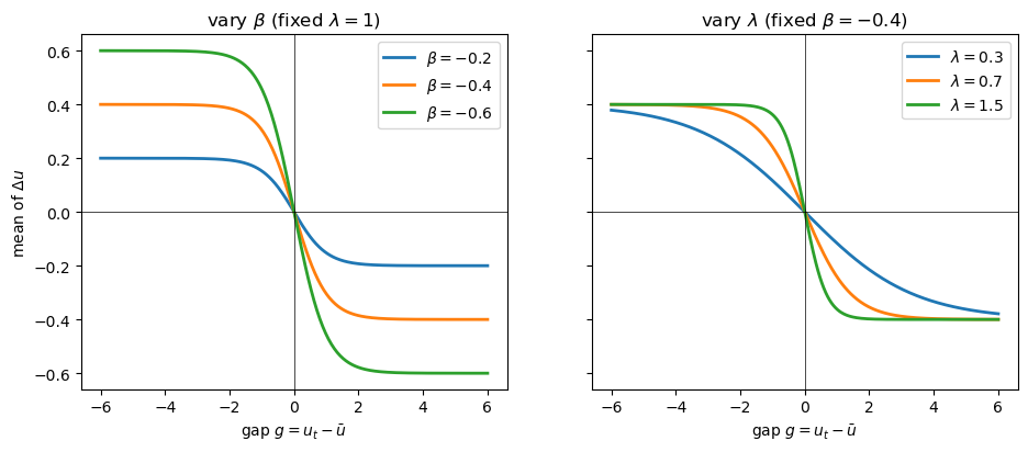
The left panel varies \(\beta\): it sets the ceiling.
Because \(|\tanh| \le 1\), the pull can never exceed \(|\beta|\) per period, so \(\beta\) is the maximum mean reversion — how hard unemployment is yanked back from a deep slump.
The right panel varies \(\lambda\) at a fixed ceiling: it sets how quickly the ceiling is reached.
The force is near-linear while \(|\lambda g| \lesssim 1\) and close to saturated once \(|\lambda g| \gtrsim 2\), so the pull reaches its ceiling once the gap exceeds roughly \(2/\lambda\) percentage points.
A large \(\lambda\) means a sharp, threshold-like reversion; a small \(\lambda\) means the model is effectively linear over the range of gaps we ever see.
Now we can see why \(\beta\) and \(\lambda\) are hard to tell apart from gentle data.
The next figure draws several \((\beta, \lambda)\) pairs that share the same product \(\beta\lambda\), alongside the deterministic recovery each implies from a deep slump.
pairs = [(-0.3, 1.0), (-0.5, 0.6), (-1.0, 0.3)]   # all have βλ = -0.3
fig, (axL, axR) = plt.subplots(1, 2, figsize=(11, 4.2))

for b, lm in pairs:
    axL.plot(gaps, b * np.tanh(lm * gaps), lw=2, label=f'$\\beta={b},\\ \\lambda={lm}$')
axL.plot(gaps, -0.3 * gaps, 'k:', lw=1, label='common slope $\\beta\\lambda=-0.3$')
axL.set_ylim(-1.1, 1.1)
axL.set_title('same local slope, different ceilings')
axL.set_xlabel('gap $g = u_t - \\bar u$')
axL.set_ylabel('mean of $\\Delta u$')
axL.axhline(0, color='k', lw=.5)
axL.axvline(0, color='k', lw=.5)
axL.legend(fontsize=8)

def recover(b, lm, u0=10.0, n=40):
    path = [u0]
    for _ in range(n):
        path.append(g(path[-1], 5.0, b, lm))
    return np.array(path)

for b, lm in pairs:
    axR.plot(recover(b, lm), lw=2, label=f'$\\beta={b},\\ \\lambda={lm}$')
axR.axhline(5.0, color='C2', ls=':', label='$\\bar u$')
axR.set_title('recovery from a deep slump $u_0 = 10$')
axR.set_xlabel('$t$')
axR.set_ylabel('$u_t$')
axR.legend(fontsize=8)
plt.show()
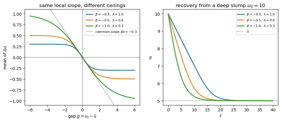
All three curves are tangent at the origin: they share the same local slope, so close to \(\bar u\) they behave identically.
Yet their ceilings differ, so from a deep slump they recover at very different speeds — the large-\(|\beta|\) pair snaps back quickly, the small-\(|\beta|\) pair only crawls.
The lesson is that \(\beta\) and \(\lambda\) separate only at large gaps.
Ordinary fluctuations near \(\bar u\) reveal just the product \(\beta\lambda\); the deep recessions are what let us tell \(\beta\) and \(\lambda\) apart.
Keep this picture in mind — it returns, in the data, when we estimate the model.
110.3.3. The stationary distribution#
Now switch the shocks back on.
Because the deterministic skeleton pulls every path back toward \(\bar u\), and the shocks keep knocking it around, the process settles into a stationary distribution centered on \(\bar u\).
The function below simulates a path of (110.1).
def simulate(u0, T, ubar, β, λ, σ, rng):
    "Simulate a path of the unemployment model from u0."
    u = np.empty(T)
    u[0] = u0
    ε = rng.normal(0, σ, T)
    for t in range(1, T):
        u[t] = u[t-1] + β * np.tanh(λ * (u[t-1] - ubar)) + ε[t]
    return u
To see the stationarity, we run two long simulations from very different starting points and compare the distributions they visit.
rng = np.random.default_rng(0)
T, σ = 20_000, 0.2
paths = {u0: simulate(u0, T, 5.0, -0.5, 1.0, σ, rng) for u0 in (2.0, 9.0)}

fig, ax = plt.subplots()
for u0, c in [(2.0, 'C0'), (9.0, 'C1')]:
    ax.hist(paths[u0][1000:], bins=60, density=True, alpha=0.5,
            label=f'start $u_0 = {u0}$')
ax.axvline(5.0, color='C2', ls=':', label='$\\bar u$')
ax.set_xlabel('$u$')
ax.legend()
plt.show()
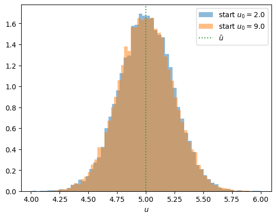
The two histograms lie almost on top of one another: the process forgets where it started and settles into the same distribution either way.
That distribution is centered on \(\bar u\) and concentrated nearby.
both = np.concatenate([p[1000:] for p in paths.values()])
print(f"min u over both long paths: {both.min():.2f} pp")
print(f"fraction of months with u < 0: {(both < 0).mean():.1e}")
min u over both long paths: 4.01 pp
fraction of months with u < 0: 0.0e+00
One caveat is worth noting.
The Gaussian shock puts positive probability on any real value, so in principle (110.1) allows a negative unemployment rate.
In practice this never bites: near \(u = 0\) the gap is large and negative, the restoring force is a firm upward \(|\beta|\), and — as the simulation confirms — the probability of \(u < 0\) is effectively zero.
The model is a good description of the dynamics in the region where unemployment actually lives; a version that respects the \((0, 100)\) range exactly is given as an exercise.
110.4. The data#
We use the same data as in A Linear Model of Unemployment: the US unemployment rate (UNRATE from FRED), monthly and seasonally adjusted.
We download the post-war record and form the same two samples.
start, end = dt.datetime(1948, 1, 1), dt.datetime(2024, 12, 31)
unrate = web.DataReader("UNRATE", "fred", start, end)["UNRATE"]
As before, we exclude the COVID-19 spike of 2020 and keep both a monthly and an annual (end-of-year) series over the full post-war period.
pre_covid = unrate[unrate.index < "2020-01-01"]
u_monthly = pre_covid
u_annual = pre_covid.resample("YE").last()
Here are the two samples.
fig, (axL, axR) = plt.subplots(1, 2, figsize=(11, 4))
axL.plot(u_monthly.index, u_monthly.to_numpy(), lw=2)
axL.set_title('monthly, 1948–2019')
axL.set_xlabel('year')
axL.set_ylabel('unemployment rate (%)')
axR.plot(u_annual.index, u_annual.to_numpy(), lw=2)
axR.set_title('annual, 1948–2019')
axR.set_xlabel('year')
plt.show()
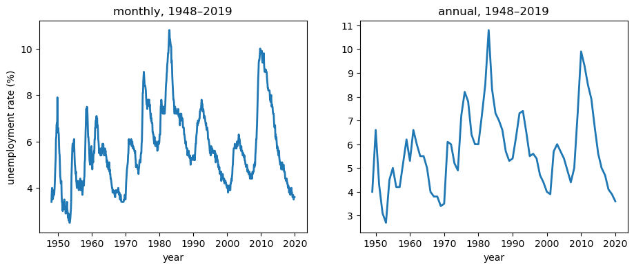
Recall from A Linear Model of Unemployment that month-to-month the series barely moves, while year-to-year it makes large swings as recessions come and go.
This difference will turn out to matter a great deal.
110.5. Bayesian setup#
We treat \(\theta = (\bar u, \beta, \lambda, \sigma)\) as unknown and place priors on them.
Conditional on \(\theta\) and the previous observation, (110.1) makes each observation Gaussian,
so the likelihood is a product of these one-step densities, and the posterior is proportional to likelihood times prior.
We use weakly informative priors that rule out economically implausible values while staying diffuse over the plausible range.
def unemployment_model(u):
    ubar = numpyro.sample("ubar",  dist.Normal(5.5, 1.0))
    β    = numpyro.sample("beta",  dist.TruncatedNormal(-0.3, 0.2, high=0.0))
    λ    = numpyro.sample("lam",   dist.HalfNormal(0.5))
    σ    = numpyro.sample("sigma", dist.HalfNormal(0.7))
    μ = u[:-1] + β * jnp.tanh(λ * (u[:-1] - ubar))
    numpyro.sample("u_obs", dist.Normal(μ, σ), obs=u[1:])
Before looking at any data we should check that these priors imply sensible behaviour.
The next cell draws parameters from the prior and simulates the annual paths they generate.
rng = np.random.default_rng(1)
T = len(u_annual)
fig, ax = plt.subplots()
for _ in range(30):
    ubar = rng.normal(5.5, 1.0)
    β = -abs(rng.normal(-0.3, 0.2))
    λ = abs(rng.normal(0, 0.5))
    σ = abs(rng.normal(0, 0.7))
    ax.plot(simulate(u_annual.to_numpy()[0], T, ubar, β, λ, σ, rng),
            lw=1, alpha=0.5)
ax.set_xlabel('$t$')
ax.set_ylabel('unemployment rate (%)')
ax.set_title('paths drawn from the prior')
plt.show()
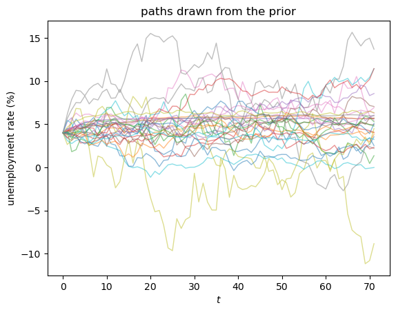
Most of the paths stay in a plausible range for an unemployment rate.
The priors are only weakly informative, so a minority wander higher or dip below zero — a sign that the priors are loose, not that they are wrong.
That is fine here: they rule out absurd values while leaving room for the data, and with seventy years of annual observations the likelihood will sharpen things considerably.
We sample the posterior with NUTS, running four chains so we can check convergence.
We use chain_method="vectorized", which evaluates all chains together on a single device, so the same code runs unchanged on a CPU or a GPU.
def run_nuts(model, data, seed=0, num_warmup=1000, num_samples=2000, num_chains=4):
    "Sample a NumPyro model with the NUTS sampler."
    mcmc = MCMC(NUTS(model),
                num_warmup=num_warmup, num_samples=num_samples,
                num_chains=num_chains, chain_method="vectorized",
                progress_bar=False)
    mcmc.run(random.PRNGKey(seed), jnp.asarray(data))
    return mcmc
110.6. Estimation#
We now fit the model — and this is where the dynamics from the previous section come back to bite.
The roadmap: fit the monthly data first and find that the nonlinearity is invisible, then fit the annual data and watch it appear, and understand why.
110.6.1. The monthly data#
We start with the monthly series.
mcmc_monthly = run_nuts(unemployment_model, u_monthly.to_numpy())
The chains mix well — r_hat is essentially \(1\) and the effective sample sizes are large.
mcmc_monthly.print_summary()
                mean       std    median      5.0%     95.0%     n_eff     r_hat
      beta     -0.18      0.16     -0.13     -0.42     -0.00   2515.37      1.00
       lam      0.13      0.19      0.05      0.00      0.38   2650.02      1.00
     sigma      0.21      0.00      0.21      0.20      0.22   3322.66      1.00
      ubar      5.61      0.73      5.62      4.30      6.69   4373.14      1.00

Number of divergences: 0
But look at what the posterior says.
def report(mcmc):
    p = mcmc.get_samples()
    b, l = np.asarray(p["beta"]), np.asarray(p["lam"])
    bl = b * l
    print(f"P(λ > 0.1)            = {np.mean(l > 0.1):.2f}")
    print(f"βλ  (local reversion) : mean {bl.mean():+.4f},  sd {bl.std():.4f}")
    print(f"implied persistence   = {1 + bl.mean():.3f}")
    print(f"corr(β, λ)            = {np.corrcoef(b, l)[0, 1]:+.2f}")

report(mcmc_monthly)
P(λ > 0.1)            = 0.34
βλ  (local reversion) : mean -0.0078,  sd 0.0048
implied persistence   = 0.992
corr(β, λ)            = +0.53
The posterior for \(\lambda\) piles up near zero, the local reversion \(\beta\lambda\) is tiny, and the implied persistence is close to one.
In other words, at monthly frequency US unemployment looks almost like a random walk, and the data cannot see the nonlinearity at all.
The reason is exactly the one we met in the dynamics section: month to month the gap barely changes, so the data only ever probe the restoring force near the origin — where it reveals just the product \(\beta\lambda\).
That shows up as a tight ridge in the joint posterior of \(\beta\) and \(\lambda\).
def ridge_plot(ax, mcmc, title):
    p = mcmc.get_samples()
    ax.scatter(np.asarray(p["beta"]), np.asarray(p["lam"]),
               s=3, alpha=0.1)
    ax.set_xlabel('$\\beta$')
    ax.set_ylabel('$\\lambda$')
    ax.set_title(title)

fig, ax = plt.subplots()
ridge_plot(ax, mcmc_monthly, 'monthly: the $\\beta$–$\\lambda$ ridge')
plt.show()
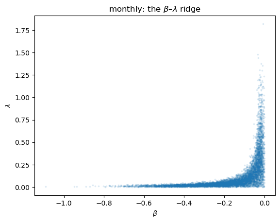
Draws trade off \(\beta\) against \(\lambda\) along a curve of constant product — the data pin down \(\beta\lambda\) but not the two parameters separately.
110.6.2. The annual data#
Now we fit the annual series, where unemployment makes large swings as recessions come and go.
mcmc_annual = run_nuts(unemployment_model, u_annual.to_numpy())
Again the chains converge cleanly.
mcmc_annual.print_summary()
                mean       std    median      5.0%     95.0%     n_eff     r_hat
      beta     -0.40      0.16     -0.40     -0.66     -0.14   4276.66      1.00
       lam      0.48      0.28      0.43      0.07      0.91   6471.64      1.00
     sigma      1.05      0.09      1.05      0.91      1.19   6930.18      1.00
      ubar      5.54      0.69      5.52      4.40      6.67   7235.04      1.00

Number of divergences: 0
The posterior is now genuinely different.
report(mcmc_annual)
P(λ > 0.1)            = 0.96
βλ  (local reversion) : mean -0.1879,  sd 0.1227
implied persistence   = 0.812
corr(β, λ)            = +0.12
The posterior for \(\lambda\) is now bounded away from zero, the local reversion \(\beta\lambda\) is sizeable, and the \(\beta\)–\(\lambda\) correlation has dropped sharply.
The nonlinearity has become visible, and the ridge has loosened into a blob.
fig, (axL, axR) = plt.subplots(1, 2, figsize=(11, 4.2))
ridge_plot(axL, mcmc_monthly, 'monthly')
ridge_plot(axR, mcmc_annual, 'annual')
plt.show()
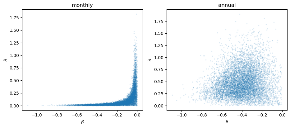
This is the payoff of the dynamics section.
Annual data contain the deep recessions — the large-gap episodes where, as we saw, \(\beta\) and \(\lambda\) pull apart — so the data can now identify them separately.
Identification of the nonlinearity comes precisely from the tails.
110.6.3. Linear versus nonlinear: is the curvature worth it?#
The annual data can identify the nonlinearity — but is the nonlinear model actually better than the linear one from A Linear Model of Unemployment?
To compare them fairly, we refit the linear model on the same annual data.
def linear_model(u):
    ubar = numpyro.sample("ubar",  dist.Normal(5.5, 2.0))
    φ    = numpyro.sample("phi",   dist.Uniform(0.0, 1.0))
    σ    = numpyro.sample("sigma", dist.HalfNormal(1.0))
    μ = ubar + φ * (u[:-1] - ubar)
    numpyro.sample("u_obs", dist.Normal(μ, σ), obs=u[1:])
This is the same linear AR(1) we estimated in A Linear Model of Unemployment; we sample it again here so the two fits sit side by side.
mcmc_lin = run_nuts(linear_model, u_annual.to_numpy())
Now we overlay the two fitted restoring forces — the mean one-step change each model implies as a function of the gap — with 90% posterior bands, over the range of gaps the data actually visit.
ann = mcmc_annual.get_samples()
βs, λs = np.asarray(ann["beta"]), np.asarray(ann["lam"])
φ_lin = np.asarray(mcmc_lin.get_samples()["phi"])

g = np.linspace(-3.5, 5.5, 200)
force_nl = βs[:, None] * np.tanh(λs[:, None] * g[None, :])
force_lin = (φ_lin[:, None] - 1.0) * g[None, :]

fig, ax = plt.subplots()
for draws, color, lab in [(force_lin, 'C1', 'linear'), (force_nl, 'C0', 'nonlinear')]:
    ax.plot(g, np.median(draws, 0), color=color, lw=2, label=lab)
    ax.fill_between(g, np.percentile(draws, 5, 0), np.percentile(draws, 95, 0),
                    color=color, alpha=0.2)
ax.axhline(0, color='k', lw=.5)
ax.axvline(0, color='k', lw=.5)
ax.set_xlabel('gap $u_t - \\bar u$')
ax.set_ylabel('mean of $\\Delta u$')
ax.legend()
plt.show()
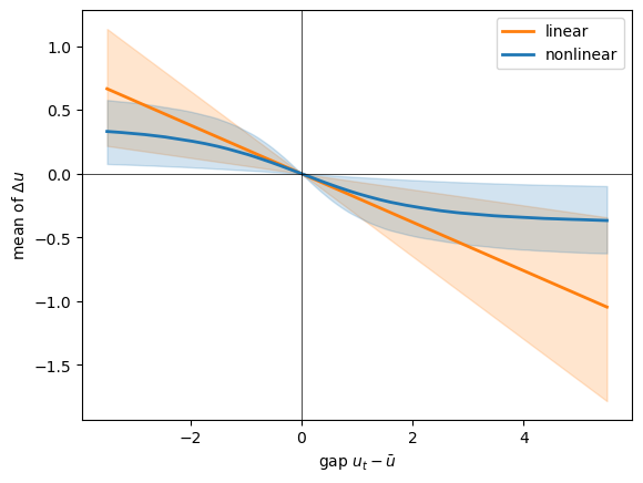
Over the range the data actually visit, the two forces are close, and their bands overlap through most of it: in ordinary times the linear model is hard to beat.
They part company at the extremes — the largest recession gaps — where the linear pull keeps growing without limit while the nonlinear one levels off.
So the curvature earns its keep exactly where we argued it should, and essentially nowhere else: in the deep recessions, not in normal times.
This is an honest verdict rather than a triumphant one — the nonlinear model is more defensible at the extremes and collapses to the linear model in the middle, the annual data mildly prefer it, and the monthly data cannot tell at all.
110.6.4. A posterior predictive check#
A fitted model should be able to generate data that look like what we observed.
We draw parameters from the annual posterior, simulate a path from each, and compare the band of simulated paths to the data.
post = mcmc_annual.get_samples()
βs, λs, σs, ubars = (np.asarray(post[k]) for k in ("beta", "lam", "sigma", "ubar"))

rng = np.random.default_rng(2)
T = len(u_annual)
u0 = u_annual.to_numpy()[0]
idx = rng.integers(0, len(βs), 400)
sims = np.array([simulate(u0, T, ubars[i], βs[i], λs[i], σs[i], rng)
                 for i in idx])
lo, mid, hi = np.percentile(sims, [5, 50, 95], axis=0)

fig, ax = plt.subplots()
yrs = u_annual.index.year
ax.fill_between(yrs, lo, hi, alpha=0.3, label='90% predictive band')
ax.plot(yrs, mid, lw=2, label='predictive median')
ax.plot(yrs, u_annual.to_numpy(), 'k', lw=2, label='observed')
ax.set_xlabel('year')
ax.set_ylabel('unemployment rate (%)')
ax.legend()
plt.show()
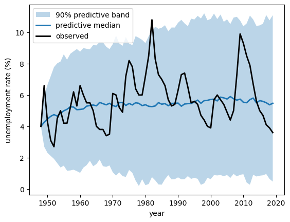
The observed series stays within the predictive band, so the model reproduces the broad swings of post-war unemployment.
It is not perfect — the model’s IID shocks miss some of the smooth, multi-year persistence of real recoveries, and the band reaches down close to zero, a reminder of the Gaussian approximation we flagged earlier — but it captures the level, the spread, and the mean reversion well.
110.7. Conclusion#
We built a compact nonlinear model of unemployment and took it from theory to data.
The dynamics are clean: a saturating restoring force gives a globally stable rest point at the natural rate \(\bar u\), with \(\beta\lambda\) setting the speed of everyday mean reversion and \(\beta\) setting how hard unemployment is pulled back from a deep slump.
It also resolves the tension we met in A Linear Model of Unemployment: the series can drift like a random walk near \(\bar u\), yet the firmer pull farther out keeps it recurrent — so “looks like a random walk” and “never wanders away” can hold at once.
The estimation taught a Bayesian lesson about identification: the nonlinearity is invisible in placid monthly data — where only \(\beta\lambda\) is identified, as a ridge — and becomes visible in annual data that contain the large swings of recessions.
And the head-to-head comparison kept us honest: within the range of ordinary experience the nonlinear model barely differs from the linear one; its advantage shows up only in the deep recessions.
What the data can tell you depends on what the data have seen.
The model still has real limitations — a constant natural rate over seventy years is the most obvious — which the exercises and the wider literature take up.
110.8. Exercises#
Exercise 110.1
Add an asymmetry term to capture the stylized fact that unemployment rises quickly in recessions but falls slowly in recoveries.
Replace the mean step in (110.1) with
where \((x)^+ = \max(x, 0)\), add a prior for \(\gamma\), refit on the annual data, and report the posterior for \(\gamma\).
Is there evidence that \(\gamma \neq 0\)?
Exercise 110.2
The model allows a negative unemployment rate, even if the event is astronomically unlikely.
Build a version that respects the range exactly by modelling \(x_t = \operatorname{logit}(u_t / 100)\) with the same tanh reversion, refit, and compare the implied dynamics with the model in the text.
Exercise 110.3
Reintroduce the COVID-19 observations you dropped.
Using the annual posterior fitted without them, compute the posterior predictive probability of an annual unemployment rate as high as the 2020 value.
How surprising is the COVID spike under the estimated model?